 Skip to content
The WordPress Button block allows you to create visually stunning call-to-action buttons to shoot up conversions and engagements. You can use this button to encourage users to take specific actions, like signing up for a newsletter, purchasing, and sharing social media content.
The Button block offers robust customization options as well. You can customize the style, color, alignment, and functionality of your buttons to suit your brand needs and aesthetics. The WordPress Buttons is a default Gutenberg block.
This article will cover a robust tutorial guide on how to use the WordPress Buttons block. Keep reading to the end.
How to Use the WordPress Buttons Block
The WordPress Buttons block can be a handy weapon to boost conversions if you know how to use it well. So, let’s get into the tutorial part without further delay.
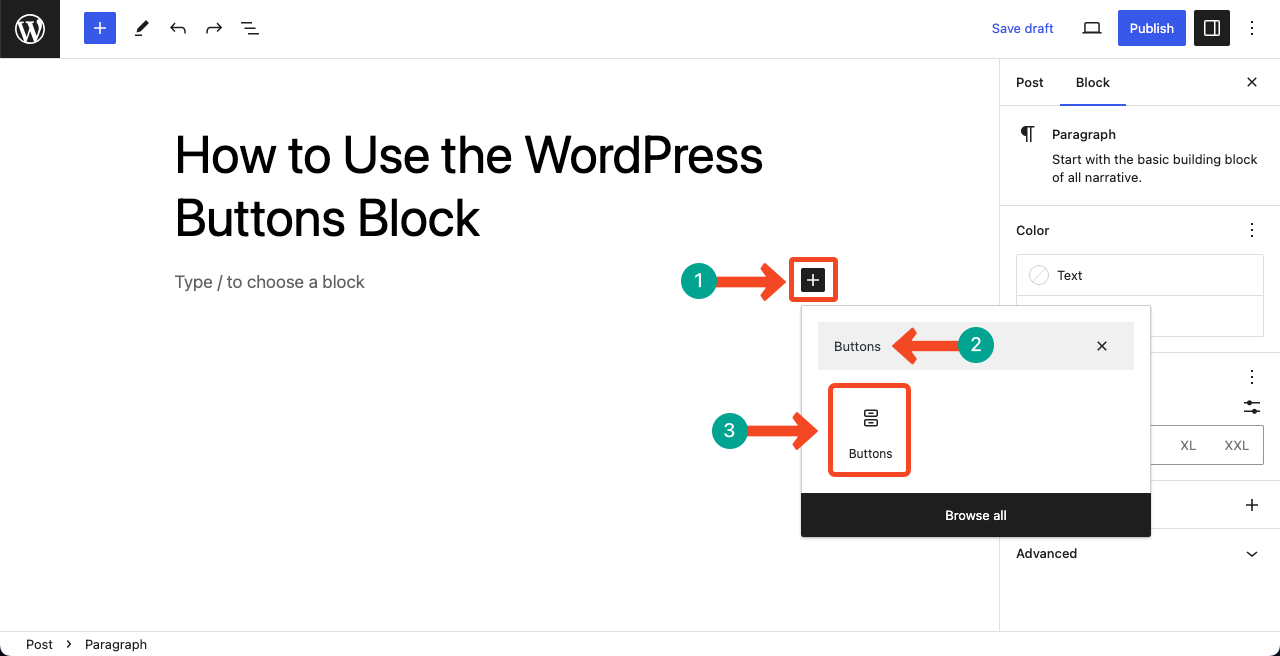
Step 01: Add the WordPress Buttons Block to Your Post/Page
Get into your WordPress dashboard. Open a post or page where you want to add the WordPress Buttons block. Hit the Plus (+) icon on a suitable position on the post or page. Type Buttons in the search box after the Gutenberg block editor opens.
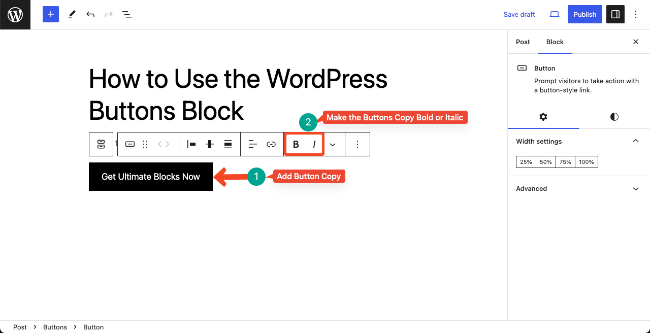
Step 02: Add Copy and Link to the Buttons Block
Clicking on the button will allow you to add a copy to the button. You may write anything you want suiting your needs. It could be ‘Sign Up Now’, ‘Get Started’, ‘Learn More’, ‘Buy Now’, ‘Shop Now’, Download Now’, ‘Subscribe’, ‘Join Us’, etc.
You may also make the button copy bold or italic using respected options from the toolbar.
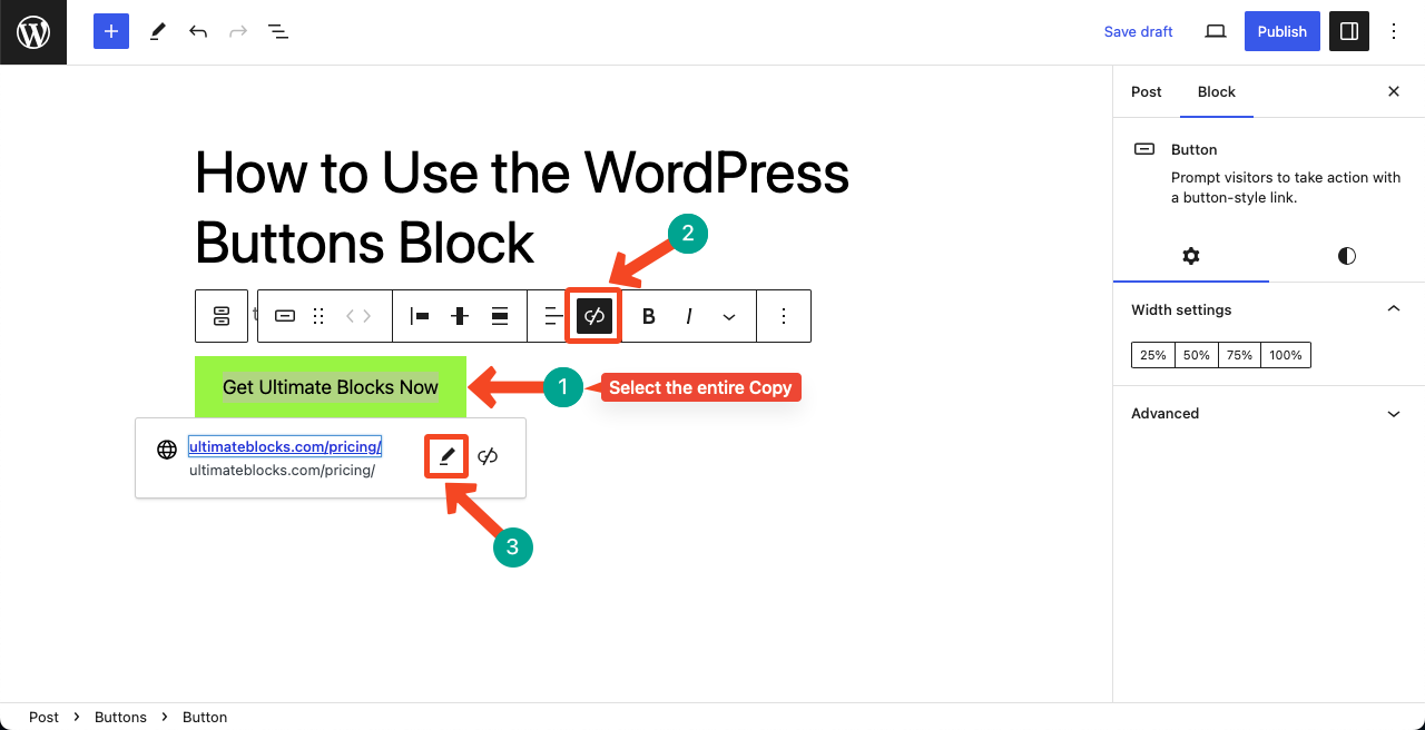
When your button copy is typed, you need to link it to your desired page, form, or post to drive users to your desired destination or action.
Select the entire copy first. Then, type (cmd+K for Mac) or (ctrl+K for Windows) to open the link-adding option. Or press the hit the Link icon from the toolbar.
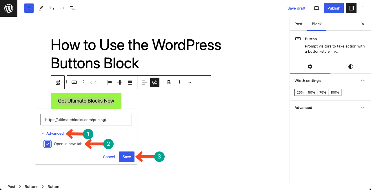
Once the link placeholder opens, copy-paste your desired link into it. Then, hit the Pencil icon.
Hitting the Pencil icon will allow you to configure opening your desired post/page in a new tab. Otherwise, your current page will be gone whenever someone clicks the button, creating a negative user experience.
Expand the Advanced option. Then, toggle on the option Open in new tab. Press the Save button at the end.
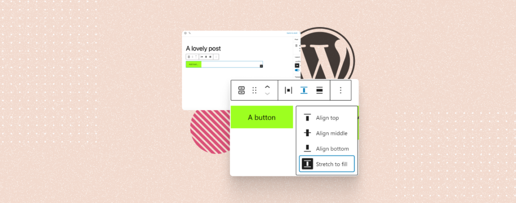
Step 03: Customize the Buttons Block (Alignment, Color, and Typography)
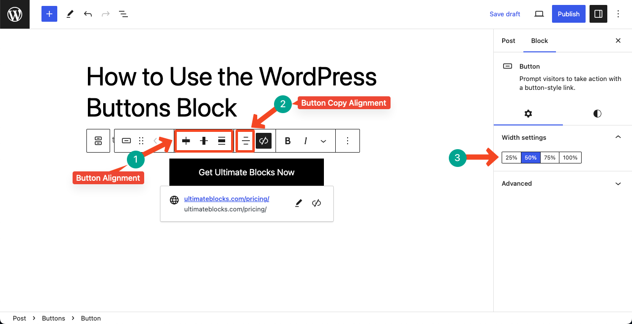
You can configure two types of alignments from the toolbar: button alignment and button copy alignment. We have pointed out the options in the image below.
After that, you can configure the width of the button from the right sidebar under the Width settings option.
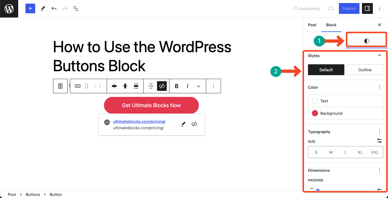
Then, go to the Styles tab. You’ll get options to configure Text Color, Background Color, Typography, Padding, Border, and Radius.
Final Words!
Hope you have benefited from this tutorial post. But there are several things to consider when using the Buttons block. Make sure to know your target audience and the purpose of the buttons. Accordingly, you have to craft the button.
Plus, the placement of buttons plays an important role in conversions. Based on your content, you need to decide where to place it to get more traction. You’ll gain experience on it over time through continuous study and regular practice.


Leave a Reply