In today’s digital age, customer service is king. Companies increasingly recognize the importance of a well-designed FAQ page to provide quick and easy access to information for their customers.
This article will examine the design of 20 different FAQ pages, each with its unique style and features. From the colorful and mobile-friendly Nintendo Switch FAQ page to the sleek and organized layout of McDonald’s FAQ page, we’ll explore how these companies use design elements like expandable accordions, clickable tabs, and search bars to create a user-friendly experience.
So, let’s dive in and see how these companies use design to help their customers find the information they need!
1. Nintendo

The Nintendo Switch FAQ page is super easy to navigate, with a top bar that makes it simple to find the information you need. The page is visually appealing, with lots of images and icons to break up the text. With clear headings and subheadings that help users find the information quickly, its user-friendliness sure leaves a mark!
2. McDonald’s

Just like their burgers, the McDonald’s UK FAQ page is well-crafted and designed to satisfy your appetite for information with its organized layout and straightforward answers to all your burning questions. Its header includes the iconic McDonald’s logo, a handy search bar, and a user-friendly navigation menu.
The main content section is divided into categories displayed as clickable tabs, making it easy to quickly find the information you need. Each tab reveals a list of related questions and answers; all presented clearly and concisely. The webpage also adapts to different screen sizes and devices for your convenience.
3. First Direct

Let’s take a look at a minimalist FAQ page now. The First Direct help and support page has everything you need to know about banking with First Direct. The page is designed with your needs in mind, featuring a clear and easy-to-navigate layout. At the top of the page, you’ll find the First Direct logo, a search bar, and links to online banking.
The main content section is divided into clickable tabs, each representing a different category, such as “Accounts and Cards” or “Security and Fraud.” Clicking on a tab will reveal a list of related topics, making it easy to find what you want.
The page’s design is also responsive, meaning that it will work seamlessly on any device, whether you’re using your phone, tablet, or desktop computer.
4. Kleenex

The Kleenex FAQ page has a design that is as clean and fresh as their tissues. The page features a sleek header with the Kleenex logo and an easy-to-use search bar. The main content area is divided into expandable accordions, so users can easily find the answers to their questions. The responsive design means that the page looks great on any device, so customers can get their Kleenex fix on the go. At the bottom of the page, users can connect with Kleenex on social media. Its user-friendly design and smart use of accordions—two prominent WordPress FAQ features—are a testament to Kleenex’s commitment to providing excellent customer service.
5. Instagram

The Instagram Help Center is picture-perfect, with a sleek and responsive design that lets users search for answers with a prominent search bar. The main content area is organized by clickable icons, allowing users to find the information quickly. This user-friendly page is a real filter-favorite.
With social media icons in the footer, connecting with Instagram on all your favorite platforms is easy. You might already have noticed that its use of icons and expandable sections are popular features found in many WordPress themes.
6. Chewy

The Chewy.com FAQ page is a purrfect example of a well-designed and responsive website, with a layout that’s easy on the eyes and the paws. The consistent color scheme and typography throughout the page make it visually appealing, with just the right amount of white space. There are also helpful icons used to indicate the category of each question, making it easier for users to navigate and find relevant information. Its use of clickable tabs and icons to organize the content is so intuitive, even your furry friend could navigate it.
The page’s structured format and emphasis on user experience align with best practices for website design, making it a hallmark of many successful WordPress websites.
7. Mejuri

The Mejuri.com FAQ page is a gem of a design, with a polished and sophisticated layout that’s sure to dazzle users. The page’s simple and clean design makes it a pleasure to use, with plenty of space and a consistent color scheme that’s easy on the eyes. The clickable categories help users find the answers they need in a flash. Overall, it’s clear that Mejuri.com has set the standard for FAQ pages, and their attention to detail is something to be admired – or, should we say, adorned!
8. Jenis
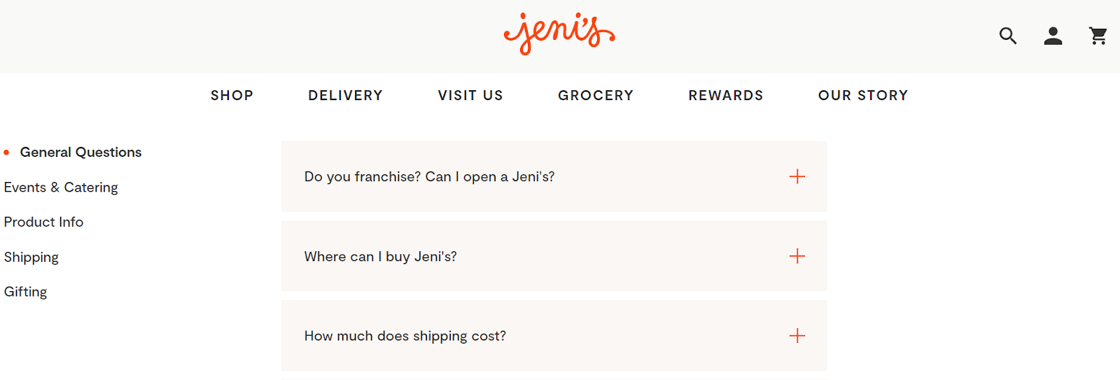
From a WordPress perspective, Jeni’s Splendid Ice Creams FAQ page is truly the “creme de la creme” of FAQ pages. The page has a sleek and modern layout, featuring a consistent color scheme and typography. Each FAQ category is clearly labeled, making it easy to find the information you need. The questions and answers are divided into collapsible sections, keeping the page organized and easy to navigate. Whether you’re on a desktop or “sundae” stroll with your mobile device, the page is designed to be responsive and user-friendly.
9. Pottery Barn
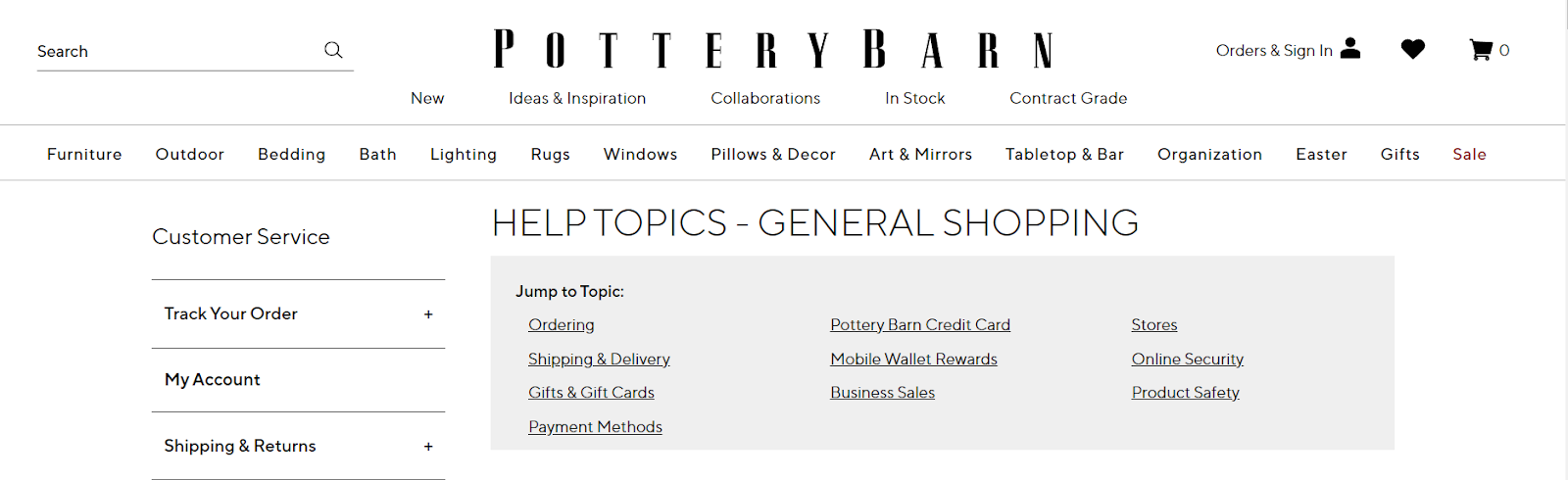
The Pottery Barn FAQ page is like a well-crafted piece of beautiful and functional pottery. Designed with simplicity in mind, this page boasts a clean and uncluttered layout that’s easy on the eyes. Navigation is a breeze thanks to intuitive categories, and the responsive design ensures that customers can access information from any device. With a consistent color scheme and polished typography, the page will surely catch the eye of anyone needing help. In short, this page is a masterpiece, bringing form and function together in perfect harmony.
10. Warby Parker

Warby Parker’s help page is a sight for sore eyes! With its clean and minimalist design, the page is easy to navigate. The top of the page features the Warby Parker logo, a search bar, and links to various sections, such as “Prescription and Lenses” and “Home Try-On.” The page’s main content is organized into clickable tabs, making it easy to find the answers to your questions. Whether you’re looking for information on ordering glasses or how to return a pair, Warby Parker’s help page has got you covered. This page is a real spectacle; with its helpful information, you won’t see double anymore!
11. PAWS Chicago

Paws Chicago’s FAQ page is as purrfect as can be from a WordPress perspective. The page layout is user-friendly, with the questions and answers divided into different categories for easy navigation. Each category is marked with a simple color scheme that highlights important elements. The use of white space, clear typography and relevant images also adds to the overall aesthetic appeal of the page. With all these elements combined, the page has a paw-some design that makes it enjoyable to browse.
12. Charmin
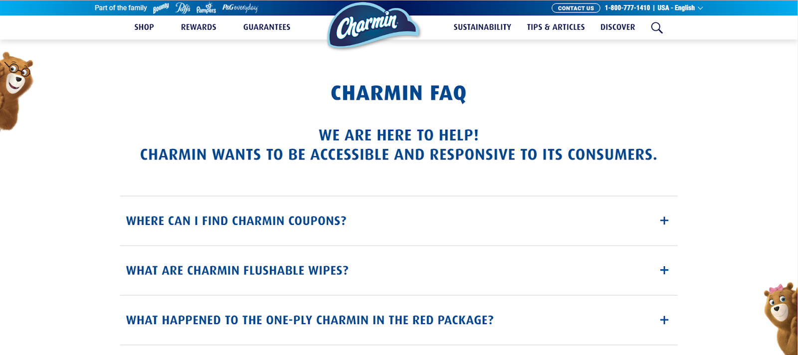
Charmin’s FAQ page is the “squeaky clean” solution to all your toilet paper questions. The design features a white and blue color scheme that is easy on the eyes and emphasizes the brand’s signature bear mascot. The navigation menu on the left-hand side of the page makes it easy to find specific topics. At the same time, the use of collapsible sections allows for easy browsing without overwhelming the user. With Charmin, you can be sure your bathroom experience will be nothing but bear-able.
13. Gucci

The Gucci FAQ page boasts an elegant, sleek design reflecting the brand’s luxury image. The page features a simple layout, with a navigation bar at the top and the main content divided into sections that address different topics. The use of white space and high-quality visuals enhances the page’s overall aesthetic, creating a seamless and immersive user experience. The page is also mobile-friendly and easy to navigate, making it convenient for users on the go. From shipping information to product care tips, this FAQ page has got you covered with style that’s haute couture!
14. IRS

The IRS may not be known for its humor, but its FAQ page certainly has a well-organized and user-friendly design. The page features a straightforward design with a white background, bold headings, and clear text. Its categories are displayed in a list format with an expandable option to view more questions and answers. The search bar at the top of the page allows users to find specific topics quickly. The responsive design ensures the page is accessible on various devices, making tax information readily available at your fingertips. It’s taxing work, but the IRS has made it as easy as possible!
15. Planet Fitness

This webpage on customer service from Planet Fitness appears to have been built using WordPress, as indicated by the presence of a WordPress toolbar and URL structure. The design is clean and minimal, with large, bold headings and simple black and blue text to make it easy to scan and read. Various WordPress plugins are utilized to enhance functionality, including a live chat feature, search bar, and contact form for customer support. Overall, this page is a “workout” in effective WordPress design, focusing on providing clear and concise information to users.
16. Dunkin’

Brewed on WordPress, the Dunkin’ Donuts “Contact Us” page is designed with a custom theme that perfectly complements the brand’s color scheme, making it a visually appealing and easy-to-navigate space for customers to get their queries answered. The color scheme is consistent with the Dunkin’ Donuts brand, with orange and pink accents throughout the page. Interactive features such as collapsible sections and search functionality make the page super engaging. Overall, the page’s design is a perfect blend of aesthetics and functionality, leaving users feeling “dough”-lighted with the experience.
17. Yasso

While the Yasso FAQ page may not be brewed on WordPress, it’s clear that their Shopify-based design is anything but vanilla.
With a clean and straightforward layout, the page’s blue and white color scheme stays true to the Yasso brand, and its responsive design ensures that it looks good on any device. The page’s interactive features, such as collapsible sections and search functionality, are the sprinkles on top, making it easy for users to scoop out the information they need. Overall, the page’s design is a perfect reflection of Yasso’s branding and values.
18. Dropbox

With a layout as organized as a meticulously curated Dropbox folder, the “FAQs” page for Dropbox Business is designed to help users easily find the information they need. The blue and white color scheme gives the page a professional look and feel, while the search bar allows users to find their answers in a flash. The page also features interactive collapsible sections that allow users to dig deeper into the topics that interest them. With its practicality and style, this page is truly “drop”-dead gorgeous!
19. AdEspresso

Brewing up some great design, the AdEspresso “FAQ” page features an organized and easy-to-navigate layout. Users can easily find what they’re looking for with its blue and white color scheme and organized headings. The page is responsive and adapts to different screen sizes, making it easy to use at your desk or on the go. Its interactive features, like collapsible sections and clickable links, help users navigate easily, giving them a smooth user experience. Overall, this page is a “latte” fun and functional addition to the AdEspresso website!
20. Zappos

Ready to step into some stylish shoes with the Zappos “General Questions” page? This page is designed to answer all your footwear queries with a well-organized layout, and crisp and concise sections that make it easy to find the answers you need. Its color scheme is on-brand, with the classic Zappos blue and white hues. The page also features interactive collapsible sections that can be hidden or shown to reveal relevant information, making the page more user-friendly and efficient.
So, whether you’re a sneakerhead or a high-heel addict, this page will have you “stepping up” your footwear knowledge in no time!
Conclusion
In conclusion, each of these FAQ pages is unique in design and style, yet all share a common goal of providing users with clear and concise information in a user-friendly manner.
With WordPress features such as expandable accordions, clickable tabs, and social media integration, businesses can easily create their own professional-looking FAQ pages to meet customers’ needs and expectations.
If you’re considering using WordPress for your own business, why not explore Ultimate Blocks, the go-to destination for top-quality WordPress blocks designed for bloggers, developers, and content marketers?
Don’t forget to share this article if you found it helpful. Thank you for reading!


Leave a Reply