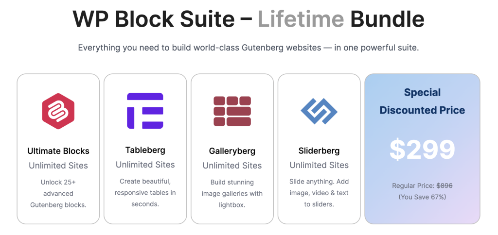
The Icon Block in Ultimate Blocks offers a simple way to add icons to your WordPress posts and pages. Ideal for highlighting features, organizing information, or enhancing visuals, it’s a practical tool for effective communication.
Adding the Icon Block #
- Open the page/post where you want to add an Icon Block.
- Click on the ‘Add Block (+)’ button and search for ‘Icon.’
- Insert the block by clicking on it.

- You can insert a custom SVG or choose any icon from the ‘Icon Library’.
- To insert an icon, click on the ‘Icon Library’.

- Choose your icon from the category, or search for your desired icon from the search box.

- Click on the icon, and it will be inserted into your page/post.
Adding SVG Using Icon Block #
- If you like to add SVG, then click on the ‘Insert Custom SVG’ button.

- Then paste your SVG code on the editor, check the preview, and hit the ‘Enter custom icon’ button.

Block Settings #
- Click on your icon block and then hit the settings button on the top right corner. It will open the block settings.

- Under block settings, you will get a lot of customization options for the Icon block.
Visibility Control Settings (PRO) #
If you like to hide/show your block from specific groups, then this option comes in handy. This is a pro feature, and to use this option, you must purchase the pro version. You can hide the icon block for everyone, or you can hide it from a specific group of people. To do it,
- Hide From Everyone: To hide from everyone, toggle the option ‘Hide the block from everyone’, and the heading will be hidden from everyone.

- Show Block to Specific Group of People: To do this, click on user role and choose the user base. Then only your selected user role will be able to see the block.

- If you like to hide the block periodically, then toggle the ‘Enable Schedule’ option and set the time. Don’t forget to also toggle the ‘Hide when schedule apply’ button.

Animation Settings (PRO) #
You can set your favorite animation to your icon and make animated icons easily. This is a pro feature.
- Just click on the animation settings and choose your favorite animation.
- Afterward, you will be able to customize your animated heading.
Terms Explained
- REPEAT: This option will allow you to repeat the animation. You can repeat animation at specific times or choose ‘Infinite’ to run animation endlessly.
- REPEAT COUNT: The number of times the animation is repeated.
- DURATION (SECONDS): Set the duration of animation here in seconds.
- DELAY (SECONDS): Set the delay after which the animation will be played
Icon Settings #
If you wish to change the icon size and rotation, then you will be able to do it from this section.

- After opening the block settings, adjust size and rotation as you need.
Custom CSS Settings #
If you would like to add any custom code to your icon, then do it from this option.

Responsive Control Settings #
If you would like to hide it for any specific device, then you can do it from here.

Toggle any option, and the icon will be hidden for that specific device.
Block Styles #
If you want to style your Icon block, then do it from the styles tab. From here, you will be able to alter styles, colors, borders, and dimensions, as well as add custom CSS.
Styles #
There are a total of five styles that come with the Icon block.
You can choose any of these styles.
Color #
From here, you will be able to change the icon’s normal color and hover color.
- Click on the normal color, and choose your color.

- In the same way, change the icon hovers and background color.
Border #
If you would like to add a border to your icon, then add it from this option.
- Add border size and color.

- Optionally, you can add border-radius as well.
Dimension Settings #
Adjust the padding and margin of your icon from here.
Final Words #
This block provides a straightforward approach to integrating icons into your content, balancing functionality with design flexibility. Try to explore other blocks as well and do more than regular development.