

The Expand block in Ultimate Blocks lets you show the first part of your content and hide the rest behind a show more link. Readers click it to see the full content and click show less to collapse it again. The block is free, and Ultimate Blocks Pro adds a fade effect on the preview and a button style for the toggle link.
| Block name in the editor | Expand |
| Plan | Free (fade effect and button style need Pro) |
| Best for | Long descriptions, author bios, terms, spoilers, transcripts and optional details |
| Live demo | See the Expand block in action |
What you can use it for #
- Shorten long product or service descriptions with a read more link.
- Show a short author bio or team member profile that expands to the full story.
- Hide spoilers, solutions or answers until the reader asks for them.
- Keep transcripts, terms or technical details on the page without making it look long.
- Fade out the end of the preview text so readers know there is more (Pro).
How to add the Expand block #
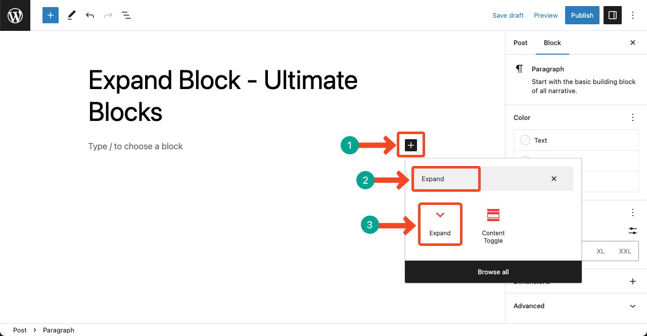
- Open the post or page in the WordPress block editor.
- Click the + (Block Inserter) button.
- Search for Expand and click the block to add it.
Add your content #
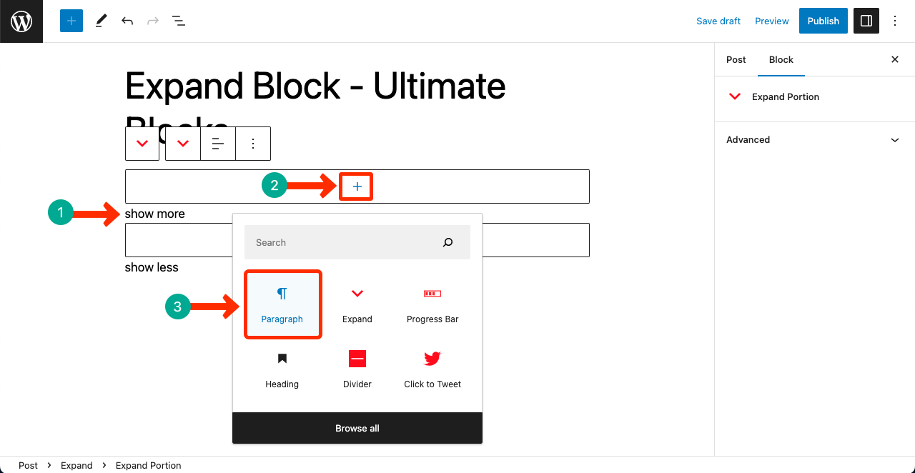
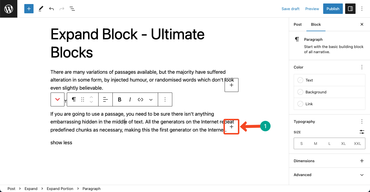
The block has two parts. Each part can hold any blocks: paragraphs, headings, images, lists, videos and more.
- First part (always visible): click the + inside it and add the content readers see first. It ends with the show more link.
- Second part (hidden at first): add the content that appears after readers click show more. It ends with the show less link. In the editor, this part is shown only while the Expand block or something inside it is selected.
Change the show more and show less text #
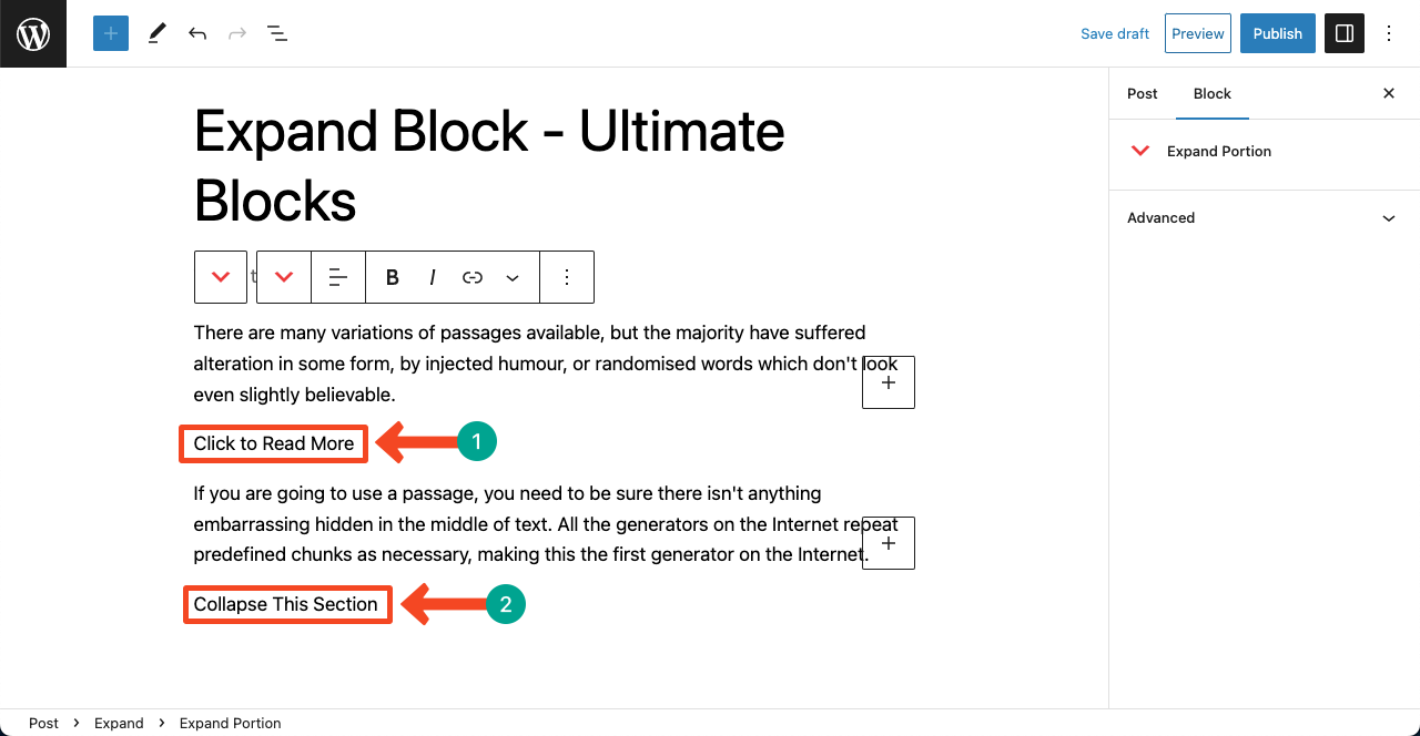
Click the show more or show less text in the editor and type your own words, for example Read the full bio or Hide details. Use the alignment buttons in the toolbar of each part to align its link left, center or right.
Here is how the Expand block works on the front end:
Settings tab #
Select the Expand block and open the block sidebar. The Settings tab (gear icon) has this panel:
Scroll Settings #
When a reader clicks show less on long content, the top of the block can end up above the screen. Scroll settings bring the reader back to the start of the block.
- Allow scrolling: scroll back to the top of the block when the reader collapses it.
- Scroll offset adjustment: stop a sticky header from covering the block. Choose Relative to first available fixed/sticky element (detects your sticky header), Relative to a specific element or Fixed height.
- Scroll reference name type and Reference element for scroll offset: (Relative to a specific element) choose id, class or element and enter its name, for example the ID of your header.
- Scroll offset (pixels): (Fixed height) the space to leave at the top, from 0 to 200 pixels.
- Fade when minimized (Pro): fade out the bottom of the visible part while the content is collapsed.
Styles tab #
Switch to the Styles tab (half-circle icon) to change spacing and, with Pro, the button style:
- Dimension Settings: Padding and Margin around the block.
- Styles (Pro): choose Default (text link) or Button to show the toggle as a button.
- Button Color and Button Background (Pro, Button style): the text color and the background color or gradient of the button.
- Button Border and Button Border Radius (Pro, Button style): add a border and round the corners.
- Button Padding (Pro, Button style): the space inside the button, in Dimension Settings.
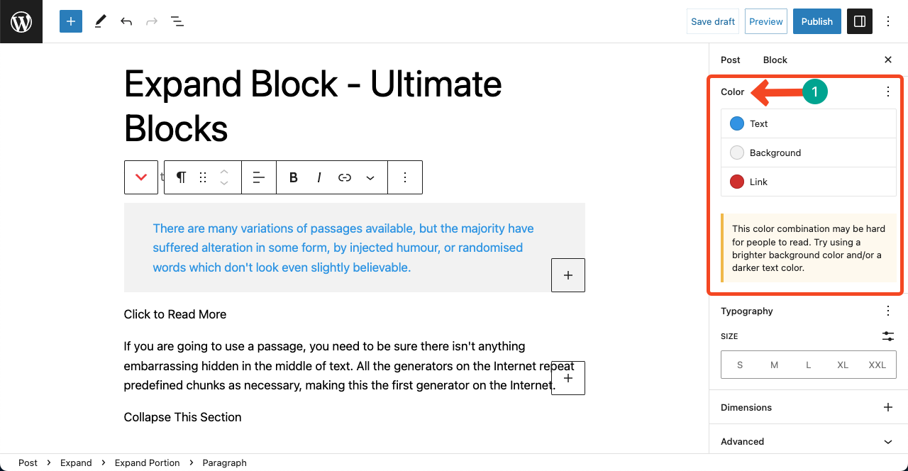
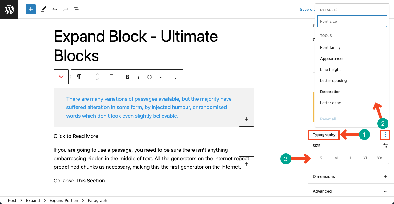
The text inside each part uses the normal settings of the blocks you add (for example, a Paragraph block has its own color and typography options):
Pro features #
- Fade when minimized: the visible part fades out at the bottom while the content is collapsed. This shows readers that more content follows.
- Button style: turn the show more and show less links into buttons and style them with Button Color, Button Background, Button Border, Button Border Radius and Button Padding.
Get Ultimate Blocks Pro to unlock these features.
Extensions you can use with this block #
- Visibility Control (Pro): show the block only to certain users or on a schedule.
- Animation (Pro): animate the block when it comes into view.
- Responsive Control: hide the block on desktop, tablet or mobile.
- Custom CSS: add your own CSS to this block only.
- Saved Styles (Pro): save your design and reuse it on other posts.
Frequently asked questions #
How do I add a read more link that expands text in WordPress?
Add the Expand block from Ultimate Blocks. Put the preview in the first part and the rest in the second part. Readers click show more to see everything.
Can I change the show more and show less text?
Yes. Click the link text in the editor and type your own words, such as Read more or Hide.
Is the hidden content still indexed by search engines?
The hidden part is in the page HTML and is only hidden with CSS until the reader clicks show more, so search engines can read it.
Can I put images or videos in the hidden part?
Yes. Both parts of the Expand block accept any blocks, including images, videos, lists and embeds.
What is the difference between the Expand block and an accordion?
The Expand block shows a preview of one piece of content and reveals the rest. An accordion, like the Accordions (UB) block, has several titled sections that open and close separately.
Is the Expand block free?
Yes. The Expand block is part of the free Ultimate Blocks plugin. The fade effect and button style need Ultimate Blocks Pro.


