The Improved Button block is an excellent solution for designing captivating buttons on your website. It allows you to customize the button size, color, width, alignment, border style, and icon. So you can fit it perfectly with the brand appeal of your website.
In the following write-up, we’ll guide you on how to use the Button (Improved) block.
Adding the Button (Improved) Block #
- Open the Gutenberg Block editor by clicking the Plus (+) icon.
- Type Button (Improved) in the search box.
- The block will appear below instantly, and click it.

General Settings #
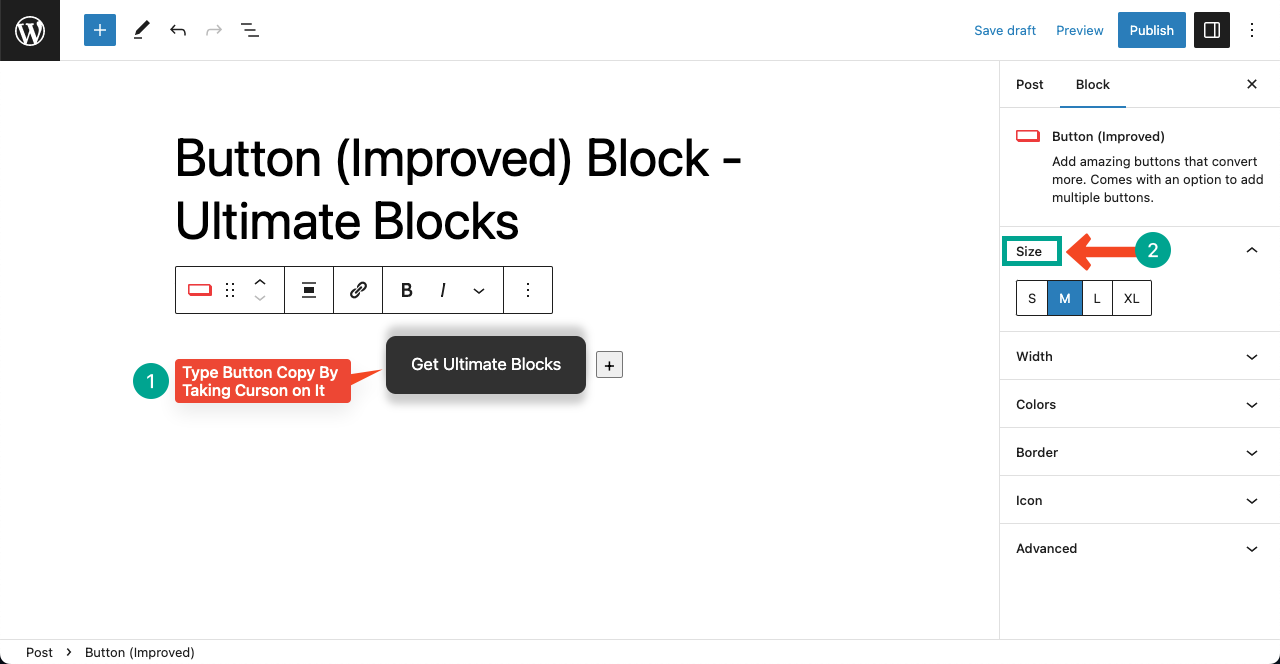
- Take your cursor on the button and click it.
- You’ll get the option to write the button copy.
- Go to the Size section on the right sidebar.
- You can set any button size from Small, Medium, Large, and Extra Large.
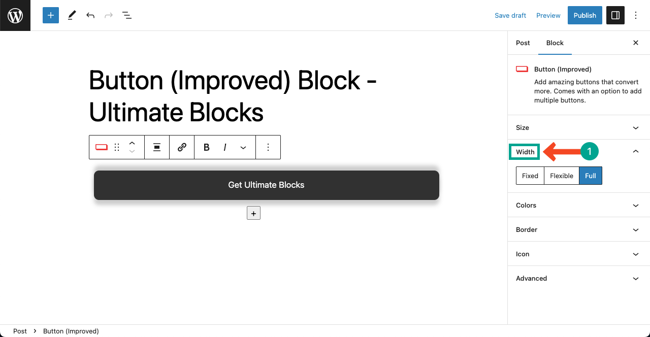
- Go to the Width section next.
- You can set whether Fixed, Flexible, or Full as the width for the button.
Terms Explained
- Fixed: The button width remains the same no matter how long your text is.
- Flexible: The button width automatically changes according to the text length.
- Full: The button contains the entire available width of the web page.
Note: We recommend you use the Flexible option.
Here’re some samples of the improved buttons.
Style #
You can stylize the Button (Improve) block in numerous ways. Let’s explore them.
Colorization
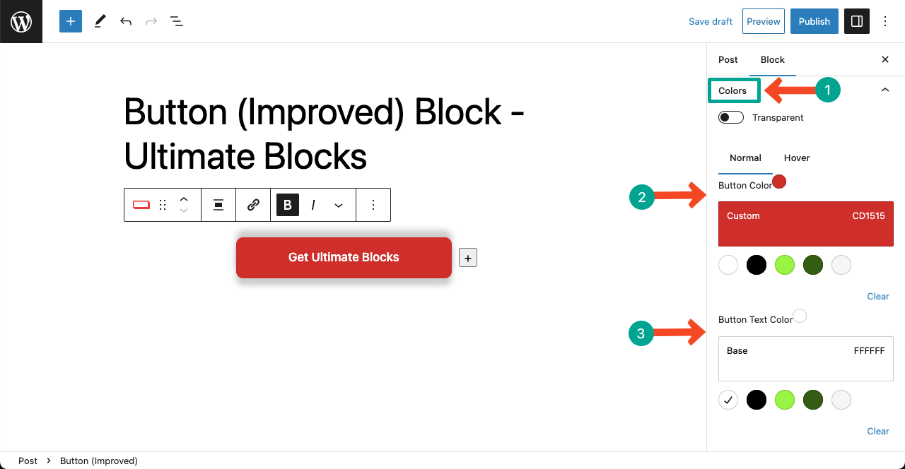
- Jump into the Color section for stylizing.
- You can change the Button Color, Hover Color, and Button Text Color.
- Bold the text to increase its thickness.
Note: The Hover Color means that the button color will change when you hover the cursor on the button.
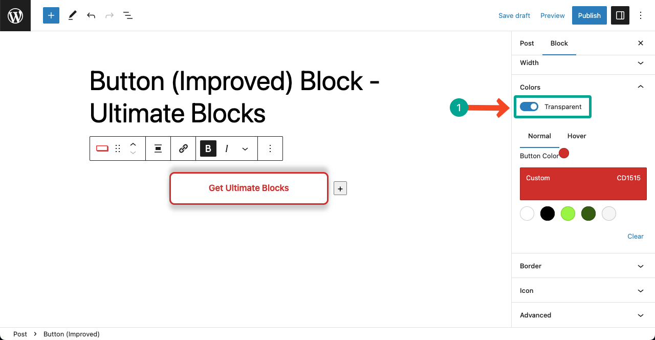
- Toggle on Transparent to make the button transparent.
- It will remove the inner button/text-background color.
- You’ll see only the button-border color.
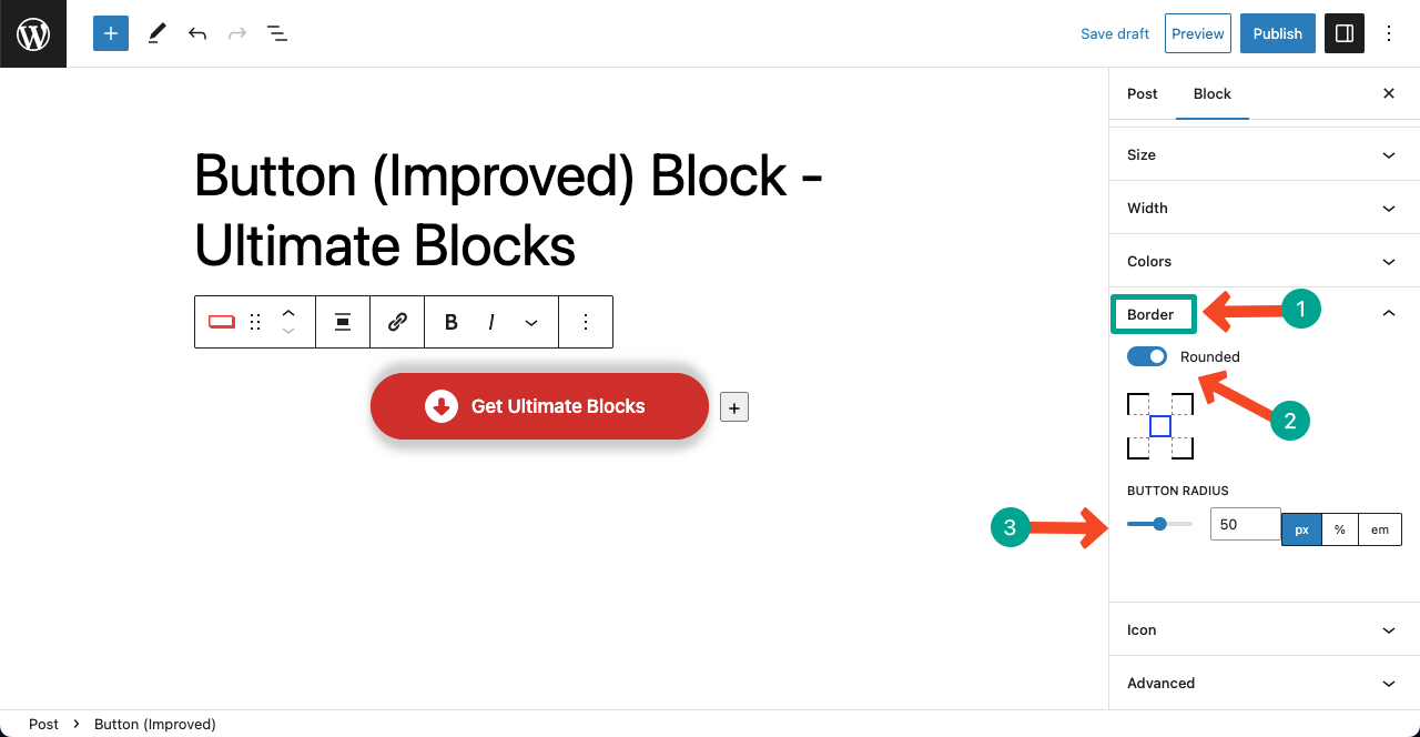
Border
- Border can beautify a button.
- Expand the Border section.
- To make the button round shaped, toggle on the Rounded option.
- Adjust the Button Radius, meaning how round you want the button to be.
Icon
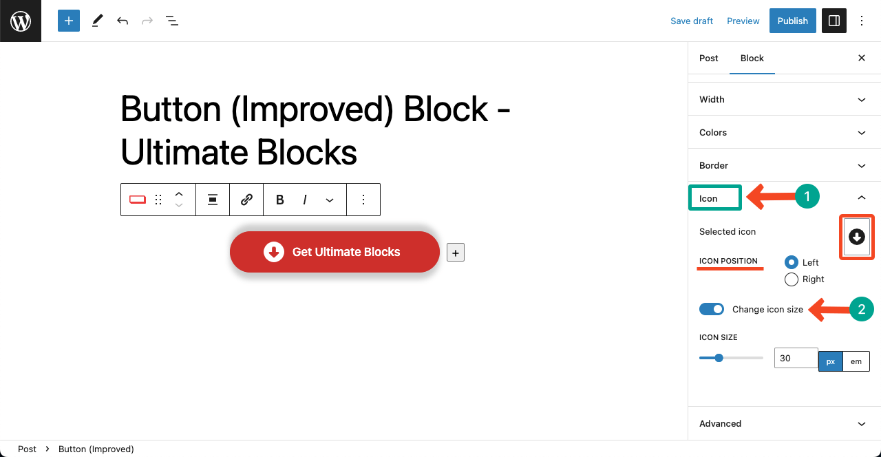
- Next, come to the Icon section.
- You can change the icon from the Selected Icon section.
- Decide the Icon Position, whether left or right.
- Toggle on the Change icon size.
- You’ll get an additional option to customize the Icon Size.
Conclusion #
Buttons are undoubtedly an important CTA element. The more interactive you make them, the higher the chance of click-through rates. Using the Button (Improved) button, you can do that seamlessly.
You can use it on any web page to allow users to download digital products, send visitors to other pages, or complete any action.


