

The Styled List block in Ultimate Blocks lets you create bulleted lists with icons instead of plain dots, split them into columns, and style the whole list or each item on its own. You can pick icons from the built-in icon library or paste your own SVG icon. The block is free, and all of its settings are included in the free plugin.
| Block name in the editor | Styled List |
| Plan | Free |
| Best for | Feature lists, benefits, pros and cons, checklists and pricing details |
| Live demo | See the Styled List block in action |
What you can use it for #
- Show product features or plan benefits with check mark icons.
- List pros and cons with different icons and colors for each item.
- Put a long list into 2, 3 or 4 columns so it takes less space.
- Build checklists and step lists for tutorials.
- Match your brand by using your own SVG icon as the bullet.
How to add the Styled List block #
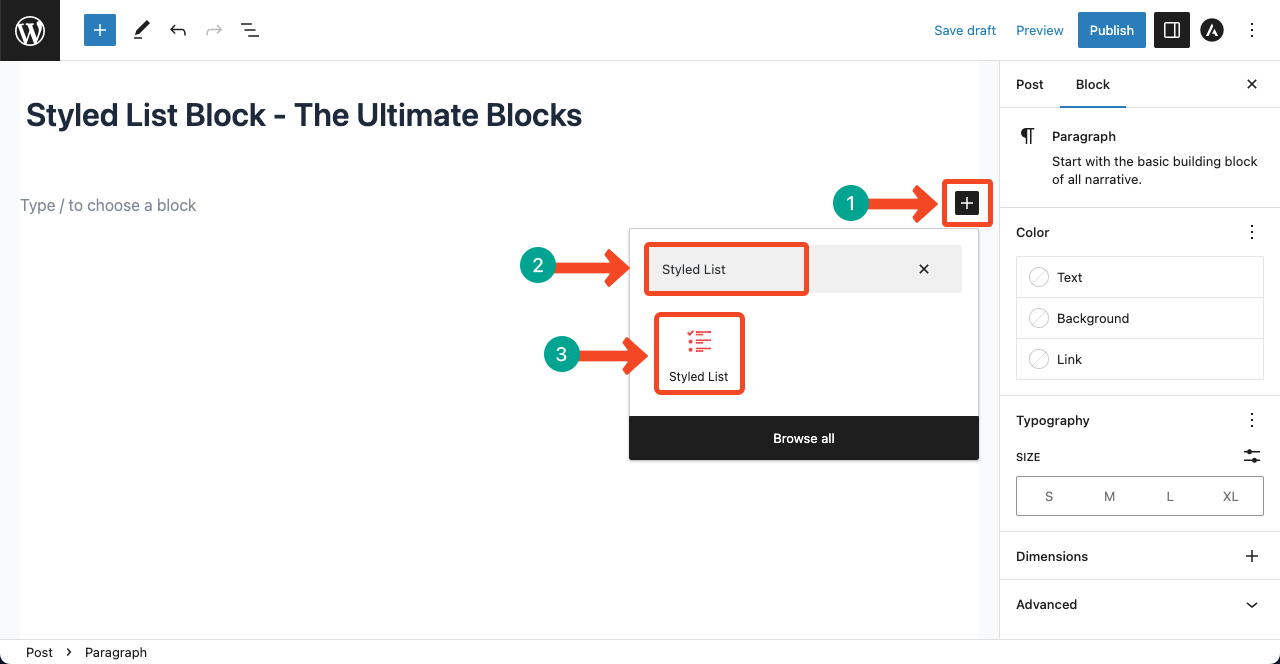
- Open the post or page in the WordPress block editor.
- Click the + (Block Inserter) button.
- Search for Styled List and click the block to add it.
- Type your first item and press Enter to add the next one.
Add, nest and edit list items #
Each line in the list is its own Styled List Item block inside the list. This means you can select any single item and change its icon, colors and font without changing the others.
- Press Enter at the end of an item to add a new item.
- Select an item and click the indent button in the block toolbar to turn it into a sub item (nested list). Click the outdent button to move it back up a level.
- Use the alignment buttons in the toolbar of the list to align the list left, center or right.
Settings tab #
Select the list (not a single item) and open the block sidebar. The Settings tab (gear icon) has these panels. Changes here apply to every item in the list.
Icon #
- Icon Source: choose Icon Library to pick a ready made icon, or Custom SVG to use your own icon.
- Select icon for list: (Icon Library) open the icon picker and click the icon you want. The default icon is a check mark.
- Custom SVG Code: (Custom SVG) paste the complete SVG markup of your icon. A Preview: appears below the field. If you see The SVG code is not valid, check that you copied the whole code from
<svgto</svg>. - Icon size: make the icons bigger or smaller (1 to 10).
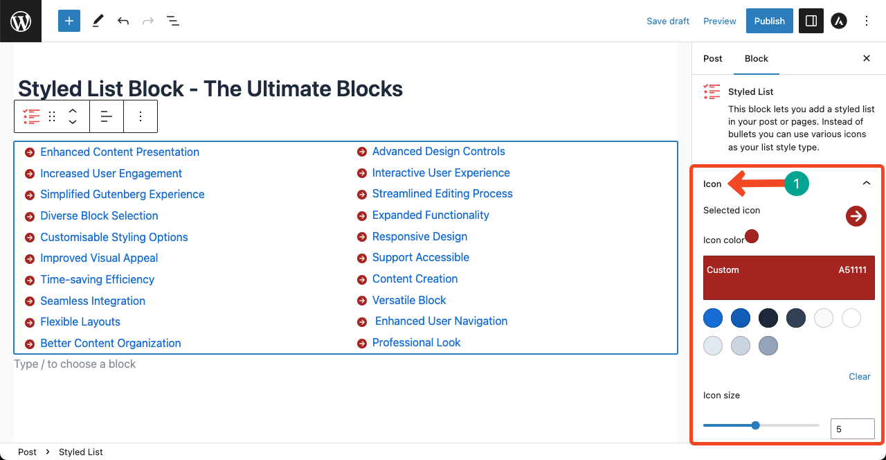
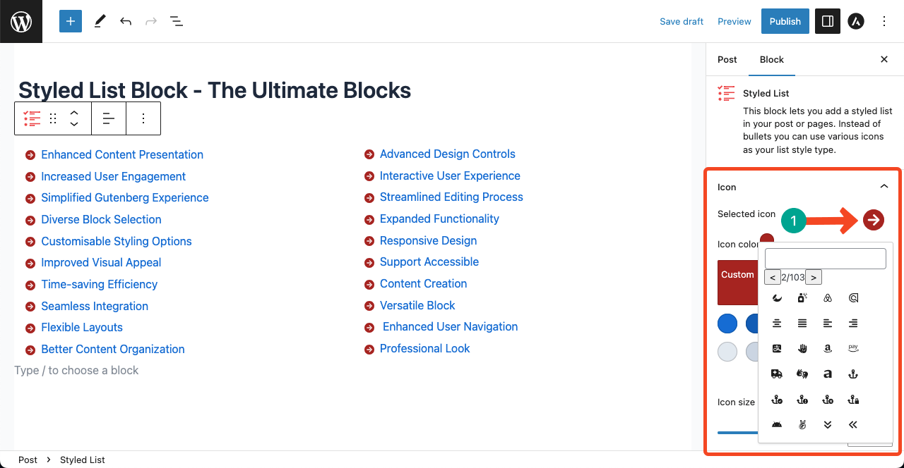
To change the icon, click the arrow next to the selected icon. A box opens with hundreds of icons. Click the one you want and every item in the list updates.
Additional #
- Columns: split the list into columns. Use the device switcher next to the label to set a value per screen size: desktop (more than 1024px, 1 to 4 columns), tablet (600px to 1024px, 1 to 4 columns) and mobile (less than 600px, up to the desktop value).
- Item spacing (pixels): the space between items, from 0 to 50.
- Customize font size: turn this on to set one Font size (pixels) for all items (10 to 50).
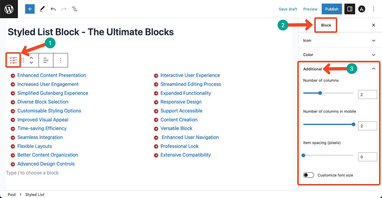
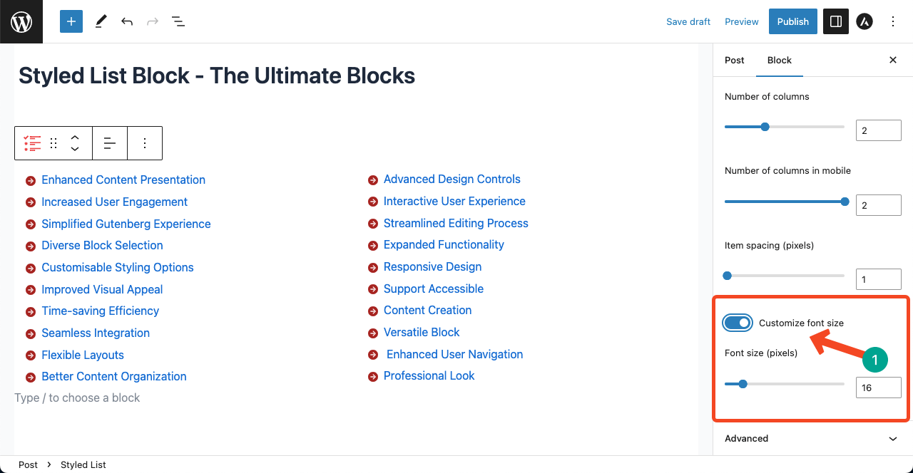
Tip: For a two column feature list on desktop that stays readable on phones, set desktop to 2 columns and mobile to 1 column.
Styles tab #
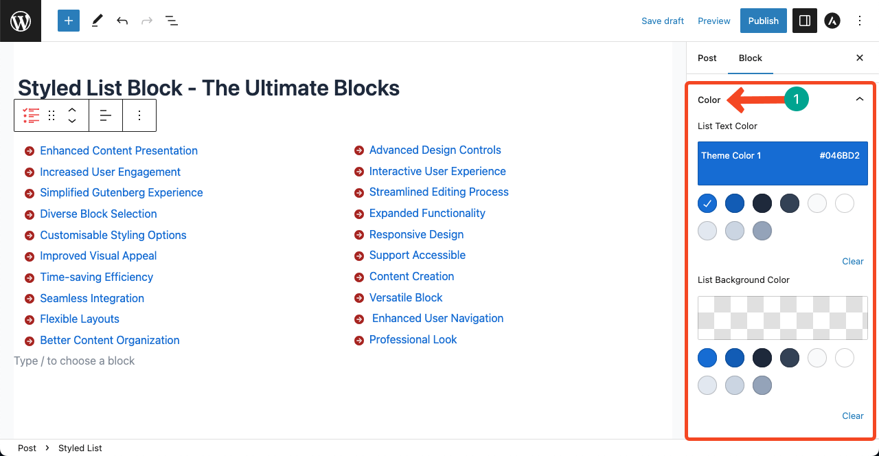
Switch to the Styles tab (half-circle icon) to change the look of the whole list:
- Color: Icon color, List Text Color and List Background Color.
- Typography: Font Family, Font Size, Appearance (font weight and style), Line Height, Letter Spacing, Decoration (underline or line through) and Letter Case.
- Dimension Settings: Padding and Margin around the list.
Style a single list item #
Click one item to select it. Its sidebar has its own settings, which override the list settings for that item only:
- Icon panel (Settings tab): Icon Source, Icon or Custom SVG Code, and Icon size. For example, use a check icon for pros and a cross icon for cons in the same list.
- Color (Styles tab): Icon Color, Item Text Color and Item Background Color.
- Typography (Styles tab): Font Family, Font Size, Appearance, Line Height, Letter Spacing, Decoration and Text Transform.
- Dimension Settings (Styles tab): Padding and Margin for that item.
Extensions you can use with this block #
- Visibility Control (Pro): show the block only to certain users or on a schedule.
- Animation (Pro): animate the block when it comes into view.
- Responsive Control: hide the block on desktop, tablet or mobile.
- Custom CSS: add your own CSS to this block only.
- Saved Styles (Pro): save your design and reuse it on other posts.
Frequently asked questions #
How do I add icons to a list in WordPress?
Add the Styled List block from Ultimate Blocks, select the list and choose an icon in the Icon panel of the Settings tab. Every item in the list gets that icon.
Can I use a different icon for each list item?
Yes. Click a single item and change its icon in that item’s Icon panel. The item icon overrides the list icon.
Can I use my own SVG icon as a bullet?
Yes. Set Icon Source to Custom SVG and paste the full SVG code into Custom SVG Code. The icon is used for every item in the list.
How do I show a list in two columns?
Select the list, open the Additional panel and set Columns. You can set a different number of columns for desktop, tablet and mobile.
Can I create nested lists?
Yes. Select an item and click the indent button in the block toolbar to make it a sub item. Click outdent to move it back.
Is the Styled List block free?
Yes. The Styled List block and all of its settings are part of the free Ultimate Blocks plugin.


