
The Buttons (UB) block in Ultimate Blocks lets you add one or more styled, linked buttons to any WordPress post or page. You can set each button’s width, colors for normal and hover states, icon, corner radius, typography and link options such as nofollow and sponsored. The block is free, and Ultimate Blocks Pro adds Fade and Wipe hover transition animations.
| Block name in the editor | Buttons (UB) |
| Plan | Free (transition animations need Pro) |
| Best for | Calls to action, download links, affiliate links, pricing and landing pages |
| Live demo | See the Buttons (UB) block in action |
What you can use it for #
- Add a clear call to action, such as Buy Now, Sign Up or Download.
- Place two buttons side by side, for example a main action and a secondary action.
- Add affiliate or sponsored links with the correct nofollow and sponsored attributes.
- Add an icon to a button, such as a download arrow or a cart.
- Make a full width button for mobile friendly landing pages.
How to add the Buttons (UB) block #
- Open the post or page in the WordPress block editor.
- Click the + (Block Inserter) button.
- Search for Buttons (UB) and click the block to add it.
- Click the button and type your button text.

Tip: Already using the core WordPress Buttons block? Select it and use Transform in the block toolbar to turn it into Buttons (UB). The text, link and colors carry over.
Add a link and more buttons #
- Add button link: select a button and click the link icon in the block toolbar. Paste the URL and click Apply.
- Open Link in New Tab: open the link in a new browser tab.
- Add Nofollow to Link: tell search engines not to follow the link. Use it for paid or untrusted links.
- Mark link as sponsored: add
rel="sponsored"for affiliate and paid links, as Google recommends. - Add a button: click the + next to the last button to add another button to the same block.
- Delete This Button: hover over a button and click the small x icon to remove it (shown when the block has more than one button).
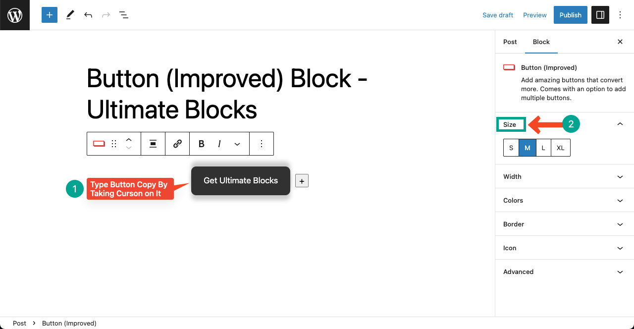
Each button has its own settings. Click a button first, then change its width, icon, colors and typography in the sidebar.
Settings tab #
Select the block and open the block sidebar on the right. The Settings tab (gear icon) has these panels:
Layout #
- Justification: choose Left, Center, Right or Space between (spreads the buttons across the full width). You can also set this from the block toolbar.
- Orientation: show the buttons in a row (horizontal) or stacked (vertical).
- Allow to wrap to multiple lines: let buttons move to a new line when there is not enough space.
Width & Size #
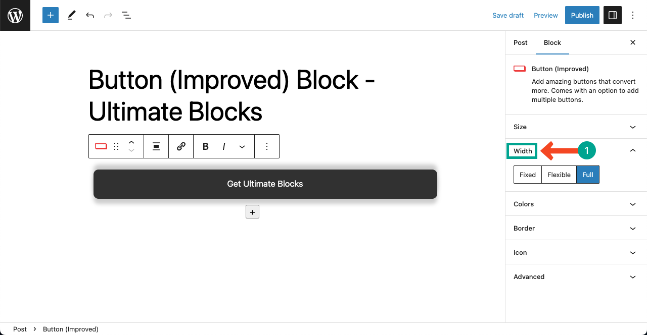
- Button Width: choose Fixed, Flexible or Full.
- Fixed: the button keeps the width you set in the Width field, no matter how long the text is.
- Flexible: the button grows or shrinks to fit its text. This is the default and works for most buttons.
- Full: the button fills the full width of its container.
To change how big the button looks, use the font Size in the Typography panel and Button Padding in Dimension Settings (Styles tab). These replace the old S, M, L and XL size buttons.
Icon #
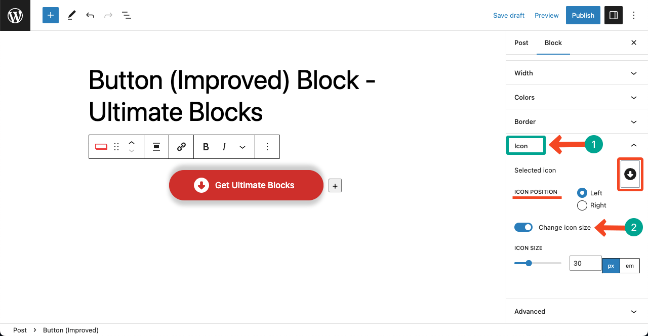
- Icon: pick an icon from the icon library, or remove it.
- Icon position: show the icon on the Left or Right of the text.
- Change icon size: turn this on to set a custom Icon size in px or em.
Styles tab #
Switch to the Styles tab (half-circle icon) to change the look of the selected button:
Button Styling #
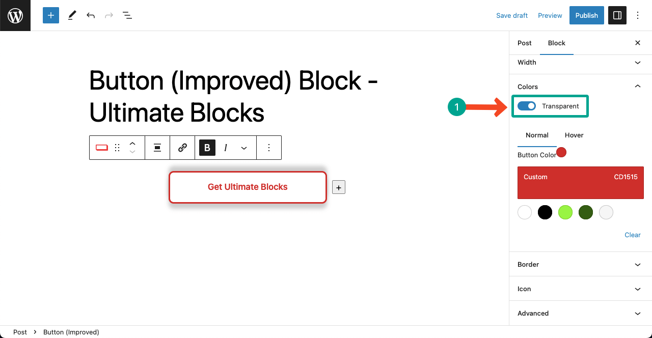
- Transparent: remove the background color and show only a colored border and text. This is a good choice for a secondary, outline style button.
- Transition animation (Pro): choose a hover effect, see Pro features below.
Color #
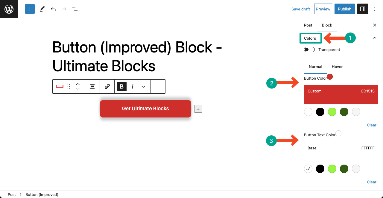
Colors have two tabs: Normal and Hover. In each tab you can set the Button Color (background) and Button Text Color. Hover colors show when a visitor moves the mouse over the button.
Typography #
Set the Font, Size, Appearance (weight and style), Line Height, Letter Spacing, Decoration and Letter case of the button text.
Border #
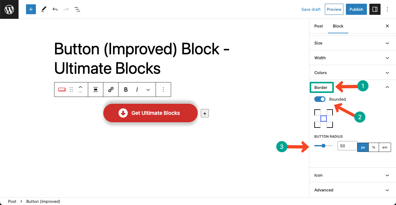
- Button Radius: round the corners. Set one value for all corners or a different value for each corner. A high value gives a pill shaped button.
- Shadow: add a drop shadow to the button.
Dimension Settings #
- Padding and Margin: space inside and around the whole block.
- Button Padding: space inside each button, around the text.
- Block Spacing: the gap between buttons.
Pro features #
- Transition animation: add a hover effect to the button. Choose Fade for a smooth color change, or Wipe for a color that slides across the button. With Wipe you can also pick the Wipe direction.
Get Ultimate Blocks Pro to unlock this feature.
Extensions you can use with this block #
- Visibility Control (Pro): show the block only to certain users or on a schedule.
- Animation (Pro): animate the block when it comes into view.
- Responsive Control: hide the block on desktop, tablet or mobile.
- Custom CSS: add your own CSS to this block only.
- Saved Styles (Pro): save your design and reuse it on other posts.
Frequently asked questions #
How do I add two buttons side by side in WordPress?
Add the Buttons (UB) block and click the plus icon next to the first button to add a second one. Set Orientation to horizontal in the Layout panel to keep them in one row.
How do I make a button open in a new tab?
Select the button, click the link icon in the block toolbar, and tick Open Link in New Tab.
How do I add nofollow or sponsored to a button link?
In the same link popup, tick Add Nofollow to Link, Mark link as sponsored, or both. Use sponsored for affiliate and paid links.
How do I make a full width button?
Select the button and set Button Width to Full in the Width and Size panel.
How do I make an outline button?
Turn on Transparent in the Button Styling panel of the Styles tab. The button keeps a colored border and text with no background.
Is the Buttons (UB) block free?
Yes. It is included in the free Ultimate Blocks plugin. The Fade and Wipe transition animations are part of Ultimate Blocks Pro.


